Project: Get Your Measure
The main feature of the site is to provide users with the ability to perform a self-assessment of their alcohol intake with results and suggested follow-up programmes.
Logo Design
The logo is based on a scale of measure. But opposite to the traditional thinking of measures increasing, this depicts the rate of measure reduces as the pin reaches it's height.
![]()
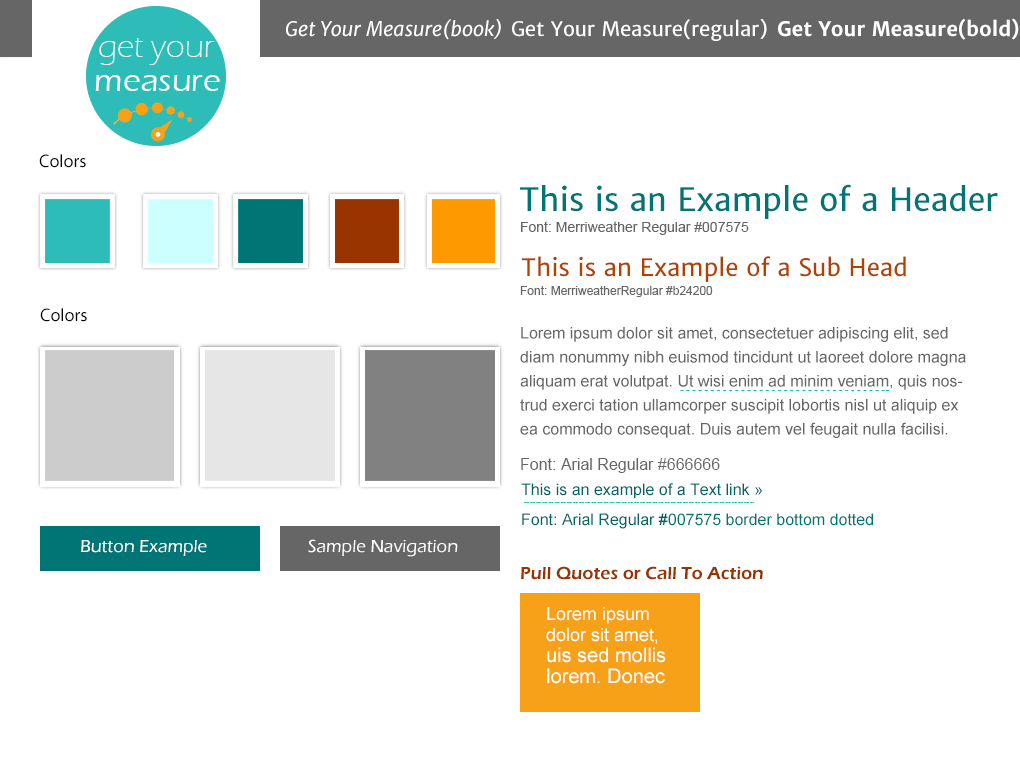
Branding
The colour blue instils strength, used by large organisations or medical institutions. A variation of the color blue was selected for the logo, increasing the amount of green to add a more calming look as this product is presented in a non-judgemental approach.
With accents of orange for headings and in keeping with the orange scale used in the logo.
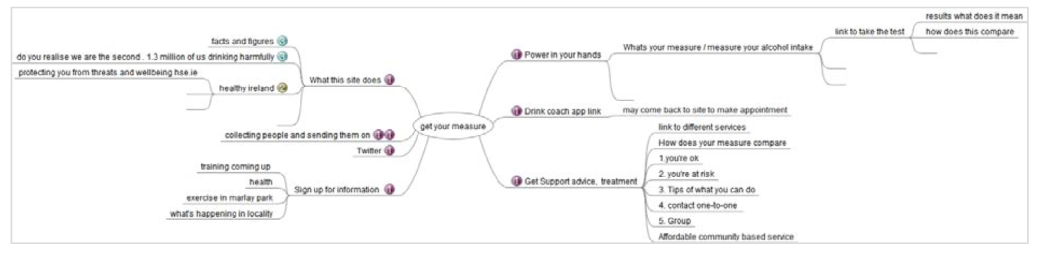
User Research
Identifying the needs of this product involved stakeholder interviews with the product owner. After which, competitor research was carried out. The result of both were mind-mapped from which the most important features were identified for use in the product.
Guerrilla Testing
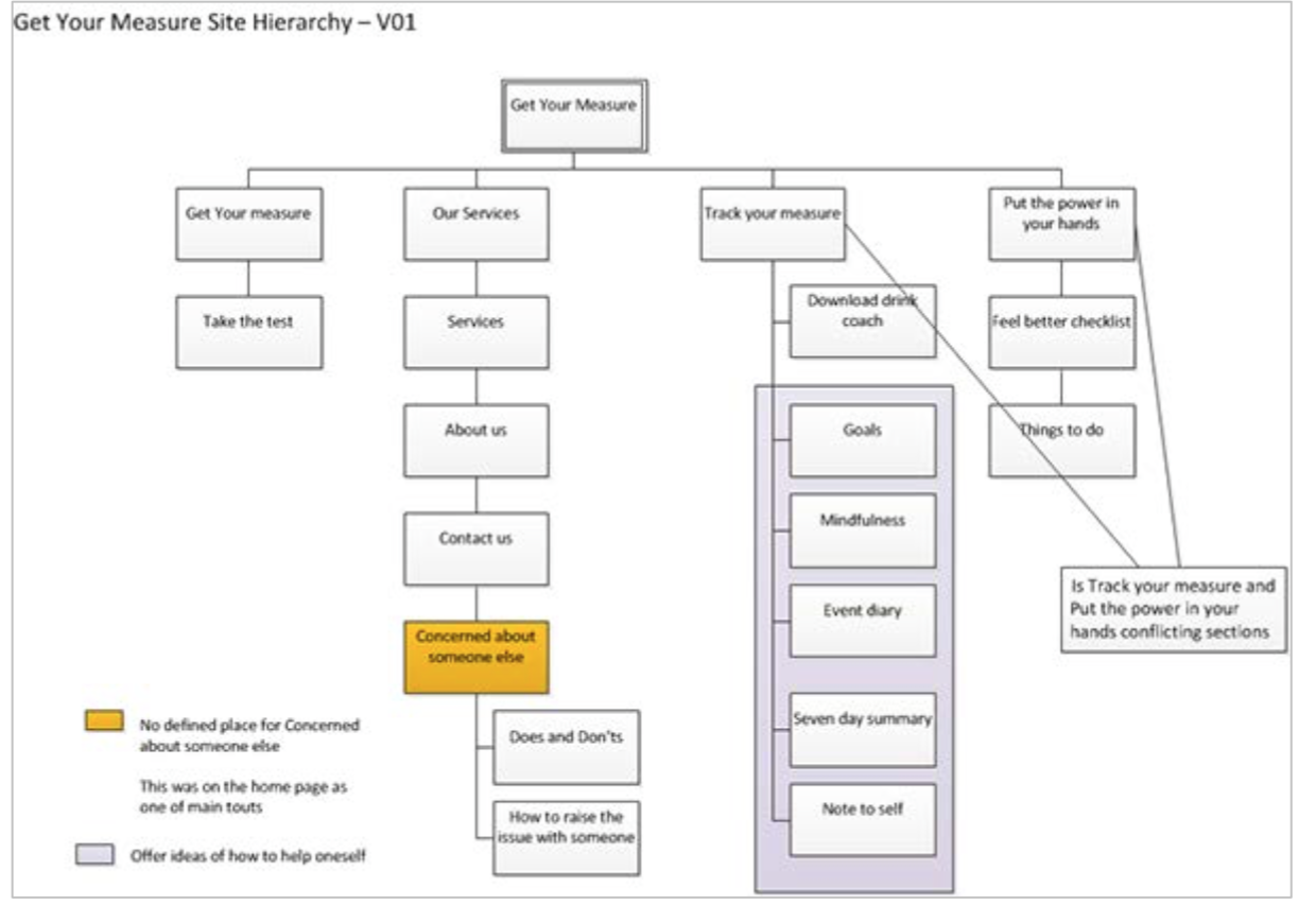
Stakeholder research was carried out using Guerrilla testing which proved very useful to design decisions, resulting in changes to the Information Architecture – Identifying four key areas to which users closely associated with, and resulted in more efficiently grouping content within the four main areas which overall made the design clearer with less distraction.
Information Architecture
Information Architecture was drawn up identifying the main areas of the site
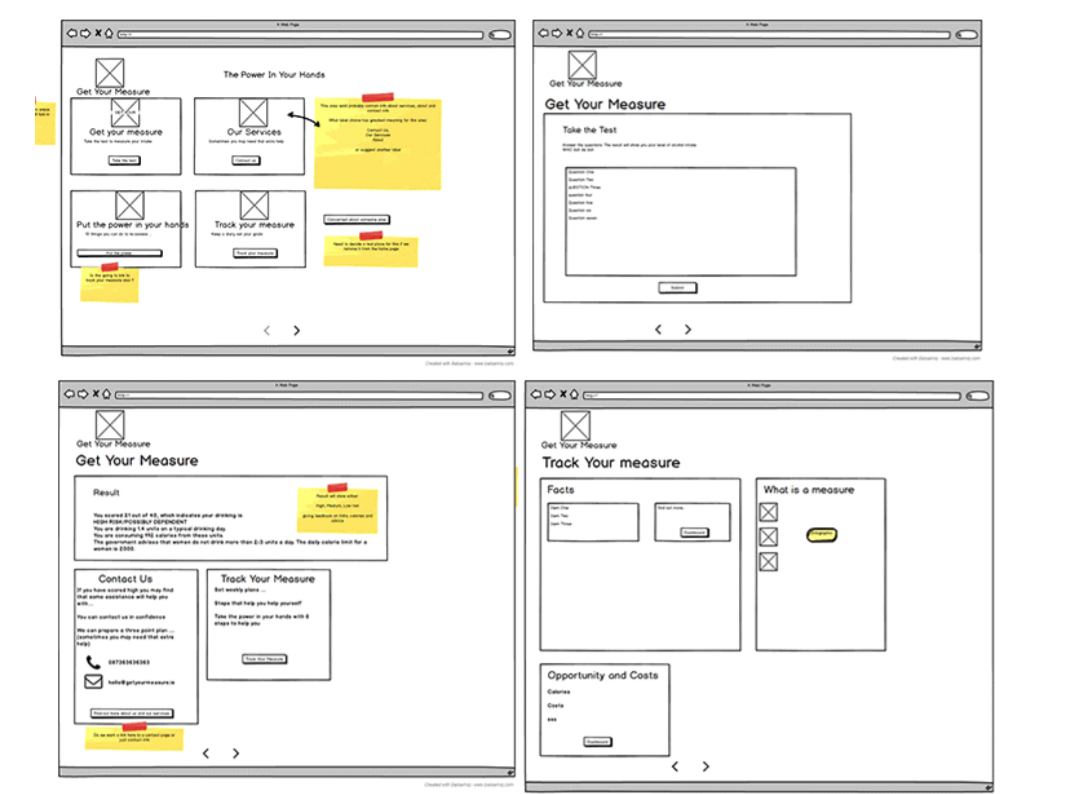
Wireframing
Wireframing the core features of the product were done using InVision and the design was further enhanced in Photoshop
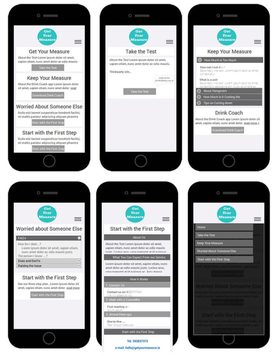
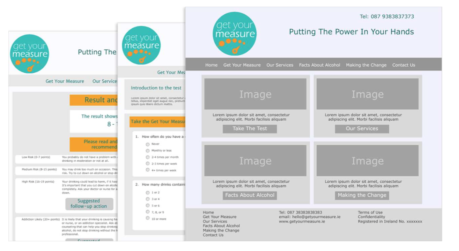
Hi Fidelity Wireframes
Hi-fi wireframes were then designed for further discussion with major stakeholders before mockups were designed for final approval.