Project: Tallaght Fest
Festival re-branding, website redesign and App design that will help plan and keep track of favoured events at the festival
Aim
Provide Tallaght Fest with a brand it deserves, a brand which displays credible communities, an emblem to be proud of that will reach out to all age groups and communities.
Usage
The site will be responsive making it easily accessible across mobile and desktop with the addition of a downloadable App.
Typography
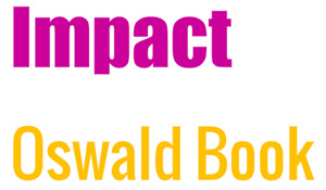
A strong font such as Impact for the logos’ main lettering and complementing this with Oswald Book minimising any competition.
Color
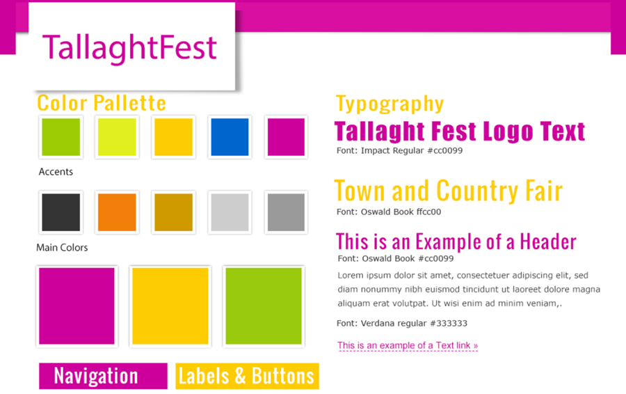
The color red-purple, the main color chosen – a color of Royalty and warmth brings richness to the brand. With contrasts of blues, yellows and greens adding strong colors to complement.
Logo Design
The logo brings together its old monastic tower still standing today in the village. Stars, a representation of festivities also represent it’s communities that have grown from a small village to a large satellite town. The beauty of it’s surrounding green hills and the local working farms.
![]()
Variations of the logo designed for use across Social Media and the Nav Fest App.
![]()
Layout and Imagery
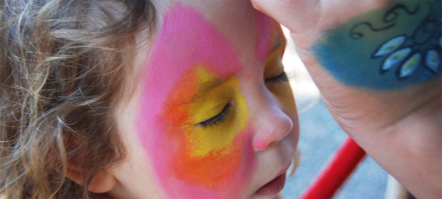
Layout will be bold and colorful with strong use of imagery. Use of existing images from previous year’s festival where available.
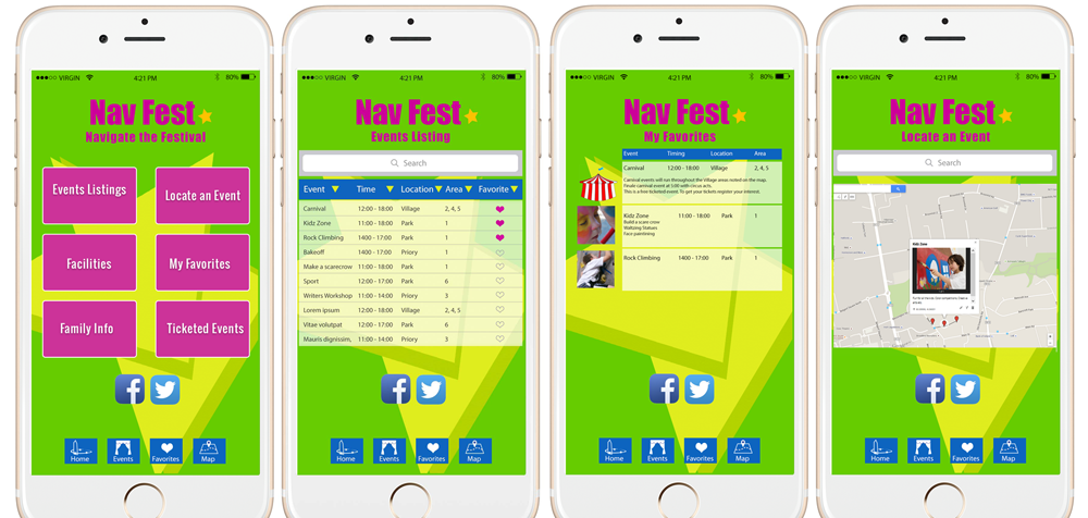
App Design
With background visuals used on the main site. The Nav Fest logo, a variation of the main logo. The main feature allows the user to save and sort favourite events and locate events.